Coming up on the Land-Grant’s birthday, we looked back at our first 8 years using our signautre flurry video technique, an animated logo, and a vintage VHS style. HBD LG!
Bit of an update around here as I have rebranded my freelance studio as The Extension Office. Named for the extension programs that provide continued research, education, and resources for the agricultural community. These programs are often affiliated with A&M-style Land-Grant Universities, which I think sums up this little studio’s relationship with Land-Grant Brewing Co nicely: taking the branding lessons we’ve learned through our work there and spreading it through the community.
To further the farming metaphor I’ve adapted the “Ohio Star” as my emblem, a popular quilting tile oft seen on barn quilts throughout the midwest.
Anyway, it’s been a bit and this has been a long gestating change, but excited to have the site back up and share what I’m working on.
Cheers!

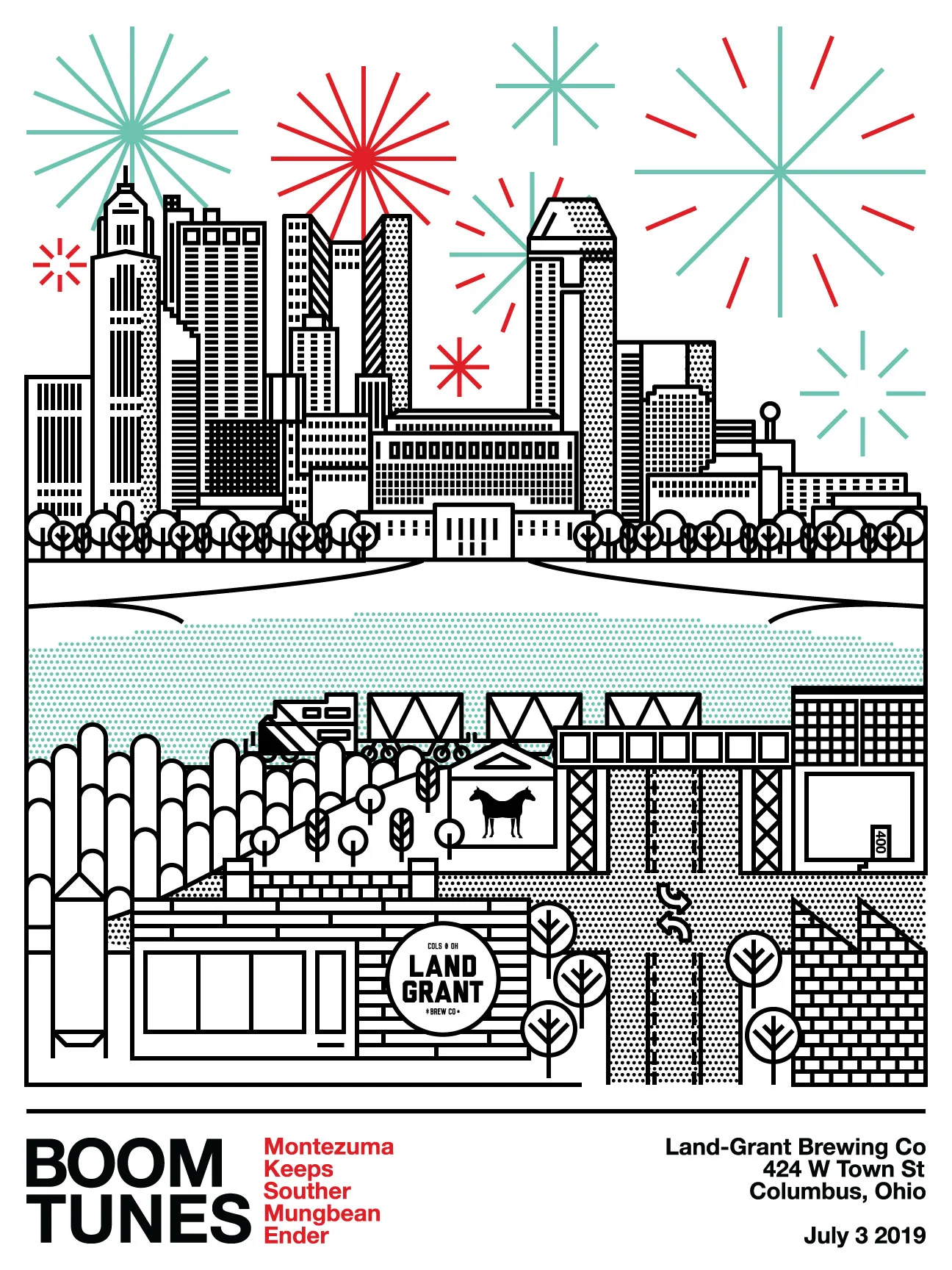
At Land-Grant, we shut down the street and hosted an all-day 3-on-3 basketball tournament and blokc party. It was sweet.


Inspiration for the VVS logotype was drawn from the concept of biomimicry, the idea of the manufactured world reflecting the shapes and structures of the natural world. Taking sort of a reverse approach I took his initials “V.V.” and set them in a stark utilitarian typeface, Futura, and built a natural shape/symbol from those geometric pieces...


Can art for Florida’s Oviedo Brewing.


Dr. Amy Acton, keeping Ohio safe.
Everyone’s second favorite Columbus band.


Special tallboy cans of Massive Juicy Pale Ale, brewed up for the Crew’s 25th season. Available at MAPFRE Stadium and the taproom only!


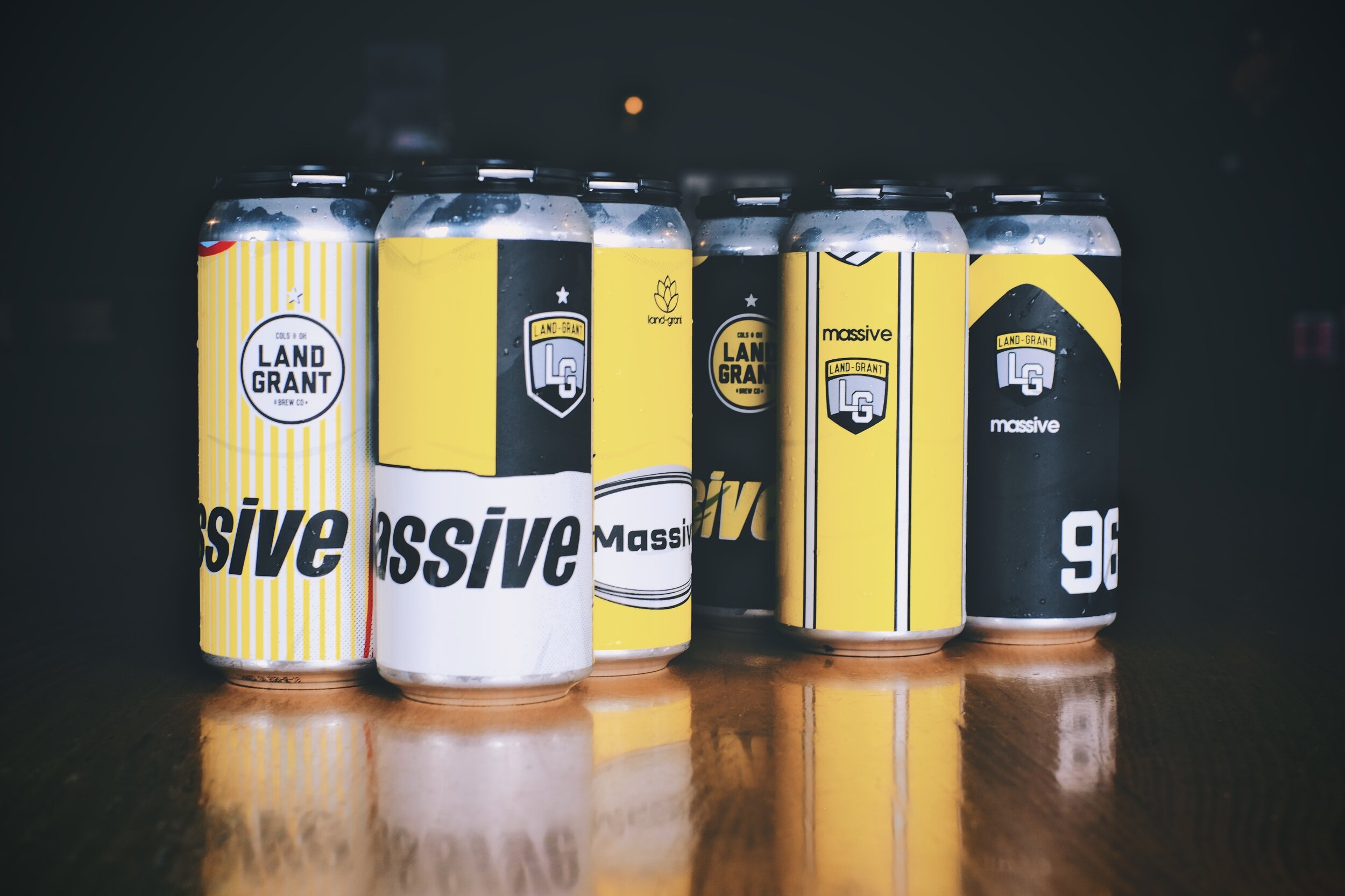


Logo design for the 25th season of Crew SC soccer.

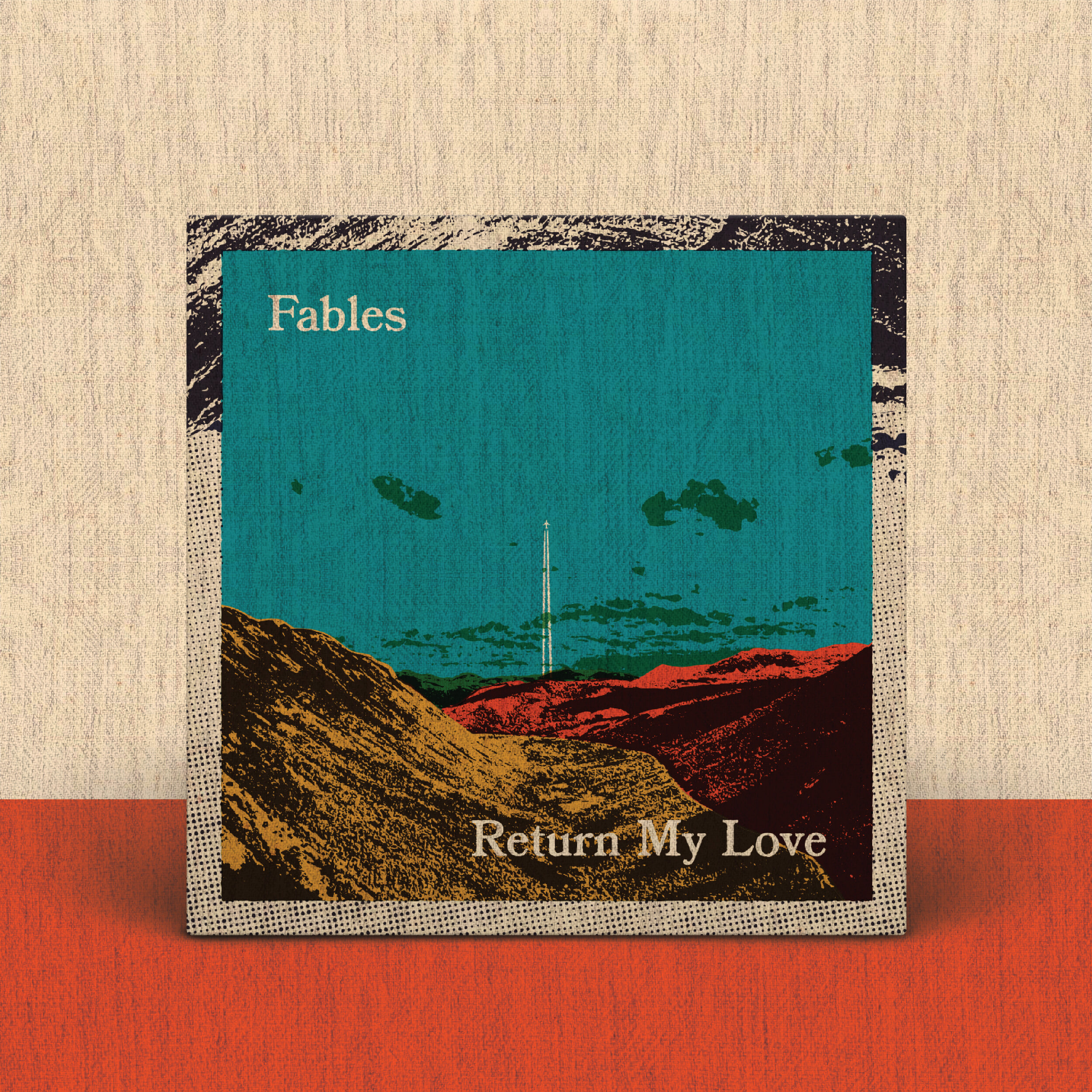
Artwork for Fables debut LP, accompanying singles, and gig poster.


Artwork for Fable’s new single.